Common Properties
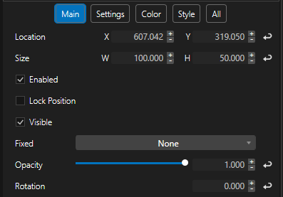
All Controls in Vertex come with a basic set of properties. They can be accessed in their inspector’s Main tab.
Location X |
X coordinate of the Control |
Location Y |
Y coordinate of the Control |
Size W |
Width of the Control |
Size H |
Height of the Control |
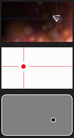
Note: ControlViews are working in a “top-left” mode. Thus a 0/0 coordinate of a control describes the upper-left corner of your ControlView. The position- and scale-pivot of every control is also in its own upper left corner, while it's rotation pivot is in its center.
|
|
Enable |
Activates/deactivates the functionality of the Control. Once disables, the Control will not be click-able by the user, but it will remain control-able via Scripting! |
Lock Position |
If activated, the position and scale handles inside the ControlView editor will not be accessible to prevent unintentionally redesign of the Control. Location- and Size-Properties in the inspector as well as Scripting is still activated to change the position and scaling. |
Visible |
If deactivated, the Control will be hidden and can not be accessed /clicked in ControlView Run-Mode anymore. Controls that have been placed behind the hidden control will become visible and click-able! Although the Control is hidden, it can still be accessed and controlled via Scripting! To create an invisible (but control-able) Control, see property “Opacity”! |
Fixed |
Options: None, Background, Foreground This feature is made for ControlViews with multiple Pages. Design elements (like Borders, Images, Labels etc.) or Controls (page navigation, Master Volume fader etc.) can be made visible and/or accessible from all pages of your ControlView. -If “Background” is selected from the dropdown menu, the Control will remain present on all ControlViews pages, but will be orientated in the background (behind the other pages own controls) -If “Foreground” is selected from the dropdown menu, the Control will remain present on all ControlViews pages, but will be orientated in the foreground (in front of other pages own controls) -If “None” is selected from the dropdown menu, the Control will only be present on its individual page
|
Opacity |
Opacity value of the Control. If the Opacity is set to 0, the Control will not be visible, but will remain fully control-able by the user. Use this for invisible control-overlays. To create an invisible (and not control-able) Control, see property “Visible”! |
Rotation |
Rotation of the Control. |
Buttons |
|||
|---|---|---|---|
ClickButton |
|
|
|
|
The ClickButton is a simple control to execute Scripts in Vertex. To remotely click a ClickButton via scripting (and to execute the ClickButtons “ScriptCode”, use the following script: ControlViewID.Controls.ClickButtonID.Click |
||
Show MouseOver Frame |
Activate/ deactivate a visible Frame that appears when the Cursor hovers the Control. (UI only) Color can be individualized with property “Mouse Over Color”. |
||
Show Status Indicator |
Activate/ deactivate status indicator bar (top bar lights up orange when pressed. UI only) |
||
|
|
||
Image Content |
Select or drag’drop any Content from the Vertex project to be displayed in the button |
||
Image Size Mode
|
Refers to Property “Image Content” Options: -None: Image Content will be displayed in button in native resolution. Positioned in center -Fill: Image Content will be stretched to fit the buttons size -Uniform: Image Content will be scaled proportionally to fit the buttons size -UniformToFill: Image Content will be scaled proportionally to fill the buttons size |
||
|
|
||
Caption |
(parent property) |
||
Show Caption |
Activate/ deactivate Caption |
||
Text |
Text to be displayed in the button |
||
Source Property |
Value of any other Vertex objects property to be displayed as Text. Please make sure to empty the “Text” property to see the Source Property Value. Manually typed Text will overwrite any incoming Source Property Value. |
||
Font |
Select one Font from the dropdown menu |
||
Font Decoration |
Select one Font Decoration from the dropdown menu |
||
Font Style |
Select one Font Style from the dropdown menu |
||
Font Weight |
Select one Font Weight from the dropdown menu |
||
Font Color |
Color property (Font) |
||
Font Size |
Define the Font Size |
||
Trim End |
Qty of characters to trim the Text (or Source Property Value) at the end |
||
Trim Start |
Qty of characters to trim the Text (or Source Property Value) at the beginning |
||
Multiline Text |
Alignment of the Text |
||
Shadow |
(parent property) Activate/ deactivate s Shadow for the Text |
||
Color |
Color property (Shadow) |
||
Softness |
Softness of the Shadow |
||
Offset X |
X Offset of the Shadow |
||
Offset Y |
Y Offset of the Shadow |
||
|
|
||
Web Link |
Link to an external Web Page the browser shall be directed to when clicking the button (WebView only) |
||
Goto Page |
Select any Page of the current ControlView to navigate the ControlViewer to when clicking the button |
||
ScriptCode |
ScriptCode that is executed on releasing the button |
||
DownScript |
ScriptCode that is executed on pressing the button |
||
HoldScript |
ScriptCode that is executed on holding the button (according to “Hold Time” property) |
||
WebScript |
ScriptCode that is executed exclusively when releasing the button in WebView |
||
Down WebScript |
ScriptCode that is executed exclusively when pressing the button in WebView |
||
Hold Time |
Time (in seconds) after pressing the button to execute the HoldScript |
||
|
|
||
Timeout |
Time (in seconds) to lock the button after releasing the button to prevent further clicking |
||
|
|||
ToggleButton |
|||
|
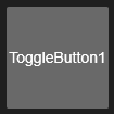
The ToggleButton has two states. It can be active/On (Value=1) or inactive(Off (Value=0). Depending on it’s state it uses a specific set of Caption- and Style-Properties as well as executes a specific Script when clicked. For information on Properties, see “ClickButton”. Properties are almost the same. Most of them are existing twice – once for each state of the ToggleButton. “ScriptCode”, “Down Script” and “Hold Script”. “Hold Time”, “Status Indicator”, “Show Mouse Over Frame” and “Mouse Over Color” are not available for ToggleButtons. To remotely switch On/Off a ToggleButton via scripting (and to execute the ToggleButtons “On/Off Script”, use the scripts: ControlViewID.Controls.ToggleButtonID.SwitchOn ControlViewID.Controls.ToggleButtonID.SwitchOff |
||
|
|||
Value |
Status of the ToggleButton [0/1] |
||
Source Property |
Another Vertex Objects Property to link this ToggleButtons “Value” to. E.g. when connected with a Clips “Mute” property, the ToggleButton will switch the Mute-Property from Unmuted to Muted when clicking the ToggleButton and vice versa. |
||
Off Script |
Script to be executed when pressing the button while it is in “On”-State |
||
On Script |
Script to be executed when pressing the button while it is in “Off”-State |
||
|
|||
SliderButton |
|||
|
The SliderButton is comparable to the ToggleButton. It is a more intuitive Control to switch between two states and to execute appropriate Scripts. For information on Properties, see “ToggleButton”. Button- and Caption related properties are not existing for SliderButtons. To remotely switch On/Off a SliderButton via scripting (and to execute the SliderButtons “On/Off Script”, use the scripts: ControlViewID.Controls.SliderButtonID.SwitchOn ControlViewID.Controls.SliderButtonID.SwitchOff |
||
|
|
||
Orientation |
Select between Horizontal and vertical orientation of the Control |
||
Active Background |
Color property (slider when active) |
||
Inactive Background |
Color property (slider when inactive) |
||
Thumb Active |
Color property (thumb when active) |
||
Thumb Inactive |
Color property (thumb when inactive) |
||
Background Border |
Color property (background border) |
||
Border Color |
Color property (slider border) |
||
Background Color |
Color property (background) |
||
Thumb Border |
Color property (thumb border) |
||
Border Thickness |
Border Thickness of Slider |
||
Background Border Thickness |
Border Thickness of Background |
||
Thumb Border Thickness |
Border Thickness of Thumb |
||
Corner Radius |
Slider Corner Radius |
||
Background Corner Radius |
Background Corner Radius |
||
|
|||
PromptButton |
|||
|
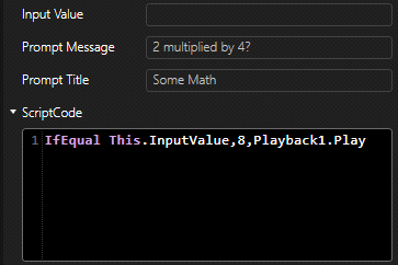
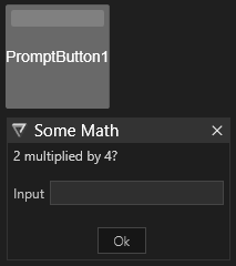
Use a PromtButton to validate a user’s intention to really click a button or request additional input. In contrast to a ClickButton, the ScriptCode will not get executed immediately, but a prompt with an optional Input-Textbox will appear first. A PromptButton is based on a ClickButton. It has the same properties, except “Down Script”, “Hold Script” and “Hold Time” , plus additional. |
||
|
|
||
Show Input Value |
Activates/ deactivates the Input-Textbox inside the prompt |
||
Prompt Mode |
Select between -None (“Ok” button ony) -Ok Cancel (“Ok” and “Cancel” button) -Yes No (“Yes“ and “No“ button) |
||
Input Value |
Value that has been typed in by the user in the optional Input-Textbox (if “Show Input Value” is enabled |
||
Prompt Message |
Message inside prompt |
||
Prompt Title |
Title of prompt |
||
|
|||
UploadButton |
|||
|
Use an UploadButton to import one or multiple content to the Vertex project. Once clicked, a File dialog opens to navigate to local files. Imported Files will optionally get assigned to a Collection and to a Clips Main Content. A UploadButton is based on a ClickButton. It has the same properties, except “Down Script”, “Hold Script” and “Hold Time”, plus additional. |
||
|
|
||
Target Collection |
Uploaded files will get assigned to the selected Content Collection |
||
Upload Target |
An uploaded file can get automatically assigned to any Vertex Clips “Main Content” property. Thus the uploaded file could get rendered immediately after uploading and file synchronization without any further scripting. |
||
|
|||
SelectionObject |
|||
|
When dragging any Vertex Object onto a ControlViews Page, Vertex will create a SelectionObject. Use a SelectionObject to enable a quick selection to a single Object (or a Group). (UI Only!) |
||
|
|
||
Select On Click |
Activated / deactivated the feature of selecting the referenced Object |
||
Selection Object |
Objects to select when clicking the button |
||
Design |
|||
|---|---|---|---|
Label |
|||
|
A Label is a control to display a text inside a ControlViews Page. Note: Once dragging any Vertex objects property onto a ControlViews Page, Vertex can automatically create a Label with a reference (assigned Source Property) to this property. |
||
|
|||
Caption |
(parent property) |
||
Show Caption |
Activate/ deactivate Caption |
||
Text |
Text to be displayed in the label |
||
Source Property |
Value of any other Vertex objects property to be displayed as Text. Please make sure to empty the “Text” property to see the Source Property Value. Manually typed Text will overwrite any incoming Source Property Value. |
||
Font |
Select one Font from the dropdown menu |
||
Font Decoration |
Select one Font Decoration from the dropdown menu |
||
Font Style |
Select one Font Style from the dropdown menu |
||
Font Weight |
Select one Font Weight from the dropdown menu |
||
Font Color |
Color property (Font) |
||
Font Size |
Define the Font Size |
||
Trim End |
Qty of characters to trim the Text (or Source Property Value) at the end |
||
Trim Start |
Qty of characters to trim the Text (or Source Property Value) at the beginning |
||
Multiline Text |
Alignment of multiline Text |
||
Shadow |
(parent property) Activate/ deactivate s Shadow for the Text |
||
Color |
Color property (Shadow) |
||
Softness |
Softness of the Shadow |
||
Offset X |
X Offset of the Shadow |
||
Offset Y |
Y Offset of the Shadow |
||
|
|||
Horizontal Alignment |
Horizontal alignment of the Text |
||
Vertical Alignment |
Vertical alignment of the Text |
||
Background Color |
Color property (Background of the label (default: transparent!)) |
||
Border Color |
Color property (Border of the label control (default: transparent!)) |
||
Border Thickness |
Thickness of control’s border |
||
Corner Radius |
Corner radius of the controls background |
||
|
|||
Web Link |
Link to an external Web Page the browser shall be directed to when clicking the Label (WebView only) |
||
|
|||
DateTimeLabel |
|||
|
A DateTimeLabel shows the current date and time. A DateTimeLabel is based on a Label. It has the same properties, except “Web Link”, plus additional. |
||
|
|||
Current Value |
Value generated by the Control based on the selected “Format” |
||
Format |
Select any Date & Time, Date or Time format from the dropdown menu |
||
|
|||
CountdownLabel |
|||
|
A CountdownLabel shows the remaining time to a specified target date. A CountdownLabel is based on a Label. It has the same properties, except “Web Link”, plus additional. |
||
|
|||
Current Value |
Value generated by the Control based on the selected “Format” and “Target Date” |
||
Format |
Select any Time format from the dropdown menu -HH:MM:SS -MM:SS -Hours (total hours left to “Target Date”) -Minutes (total minutes left to “Target Date”)) -Seconds (total seconds left to “Target Date”)) |
||
Target Reached Text |
Text to be displayed in the Label when the “Target Date” is reached |
||
Target Date |
Target Date/Time to count down to. Format: MM/DD/YYY HH:MM:SS |
||
|
|||
Image |
|||
|
Adds an image file to ControlView. |
||
|
|||
Size Mode |
Refers to Property “Content” Options: -None: Image Content will be displayed in the controls frame in native resolution. Positioned in center -Fill: Image Content will be stretched to fit the control frames size -Uniform: Image Content will be scaled proportionally to fit the control frames size -UniformToFill: Image Content will be scaled proportionally to fill the control frames size |
||
Content |
Select or drag’drop any Content from the Vertex project to be displayed in the control |
||
|
Background Color |
Color property (Background of the control (default: transparent!)) |
|
|
Border Color |
Color property (Border of the control (default: transparent!)) |
|
|
Border Thickness |
Thickness of control’s border |
|
|
Corner Radius |
Corner radius of the controls background |
|
|
|||
ToggleImage |
|||
|
Switches between two Images based on the Controls “Value”. A ToggleImage control is based on an Image control. It has the same properties plus additional. |
||
|
|||
Value |
State of the toggle (activated or deactivated) |
||
Off Image |
Image to be displayed when “Value” is off |
||
On Image |
Image to be displayed when “Value” is on |
||
Source |
Source Property. Assign any Vertex Objects property. This property will be the reference for the ToggleImage “Value” property. |
||
|
|||
LED |
|||
|
A LED can be used to indicate a properties state (Off/On, 0/1). |
||
|
|||
Value |
State of the control |
||
Mode |
Select from the dropdown menu: -Continous (default value. LED will represent the Values-state) -Temp Hold (if activated, LED will change the color shortly for the time defined in “Temp Hold Time” on Value change) |
||
Fade In Time |
Time to fade to “On Color” |
||
Fade Out Time |
Time to fade to “Off Color” |
||
Temp Hold Time |
Refers to “Mode: Temp Hold”. Time to temporarily hold the “On Color” on “Value” change |
||
Source Property |
Source Property. Assign any Vertex Objects property. This property will be the reference for the LEDs “Value” property |
||
Background Color |
Color property (controls background) |
||
Border Color |
Color property (Controls border) |
||
Led Background Color |
Color property (LED background. Default: transparent) |
||
LED Border Color |
Color property (LED Border. Default: transparent) |
||
Off Color |
Color property (LED center if Value = off) |
||
On Color |
Color property (LED center if Value = on) |
||
Border Thickness |
Controls border thickness |
||
Corner Radius |
Controls corner radius |
||
LED Border Thickness |
Thickness of LED border |
||
|
|||
TitleBox |
|
|
|
|
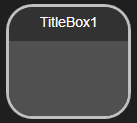
Design element to entitle and surround other controls. |
||
|
|
||
Caption |
(parent property) |
||
Show Caption |
Activate/ deactivate Caption |
||
Text |
Text to be displayed in the TitleBox’s title |
||
Source Property |
Value of any other Vertex objects property to be displayed as Text. Please make sure to empty the “Text” property to see the Source Property Value. Manually typed Text will overwrite any incoming Source Property Value. |
||
Font |
Select one Font from the dropdown menu |
||
Font Decoration |
Select one Font Decoration from the dropdown menu |
||
Font Style |
Select one Font Style from the dropdown menu |
||
Font Weight |
Select one Font Weight from the dropdown menu |
||
Font Color |
Color property (Font) |
||
Font Size |
Define the Font Size |
||
Trim End |
Qty of characters to trim the Text (or Source Property Value) at the end |
||
Trim Start |
Qty of characters to trim the Text (or Source Property Value) at the beginning |
||
Multiline Text |
Alignment of multiline Text |
||
Shadow |
(parent property) Activate/ deactivate s Shadow for the Text |
||
Color |
Color property (Shadow) |
||
Softness |
Softness of the Shadow |
||
Offset X |
X Offset of the Shadow |
||
Offset Y |
Y Offset of the Shadow |
||
|
|
||
Body Background |
Color property (body) |
||
Title Background |
Color property (title) |
||
Titlebox Border Color |
Color property (border) |
||
Titlebox Border Thickness |
Border Thickness |
||
Titlebox Corner Radius |
Corner Radius |
||
|
|||
Border |
|||
|
Design element to surround other controls. Can also be used to draw a line if width or height is small enough. |
||
|
|
||
Background Color |
Color property (background) |
||
Border Color |
Color property (border) |
||
Border Thickness |
Border Thickness |
||
Corner Radius |
Corner Radius |
||
|
|||
Ellipse |
|||
|
Design element. |
||
|
|
||
Background Color |
Color property (controls background) |
||
Border Color |
Color property (controls border) |
||
Ellipse Fill Color |
Color property (ellipse’s background) |
||
Ellipse Border Color |
Color property (ellipse’s border) |
||
Border Thickness |
Controls border thickness |
||
Corner Radius |
Controls corner radius |
||
Ellipse Border Thickness |
Ellipse’s border thickness |
||
Input |
||
|---|---|---|
ContentPanel |
||
|
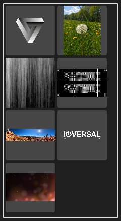
Overview of all Contents of a selected Collection. The last selected Content item is stored in a control’s property for further utilization. This control can be used for an end-user friendly content management system. |
|
Size Mode |
Size Mode of the content items Options: -None: Image Content will be displayed in the items in native resolution. Positioned in center -Fill: Image Content will be stretched to fit the items size -Uniform: Image Content will be scaled proportionally to fit the items size -UniformToFill: Image Content will be scaled proportionally to fill the items size |
|
Item Height |
Height of the single content items |
|
Item Width |
Width of the single content items |
|
Max Count |
Maximum content items in this ContentPanel |
|
StartIndex |
Start-Offset of Content items |
|
Content Collection |
Select a Content Collection to be used as source for the ContentPanel |
|
Selected Content |
This property stores the last selected item. Value is a Content Object (IDs etc. can be read out via Scripting, e.g. ControlViewID.Controls.ContentPanelID.SelectedContent.GetId) |
|
Target Content Property |
A selected content item can get automatically assigned to any Vertex Clips “Main Content” property. Thus, the selected file could get rendered immediately after clicking without any further scripting. |
|
Background Color |
Color property (controls background) |
|
Border Color |
Color property (controls border) |
|
Item Background Color |
Color property (Items background) |
|
Item Border Color |
Color property (Items border) |
|
Border Thickness |
Controls border thickness |
|
Corner Radius |
Controls corner radius |
|
Item Border Thickness |
Items border thickness |
|
Item Border Corner Radius |
Items border corner radius |
|
Item Gap Size |
Size of the gap in between items |
|
Slider |
||
|
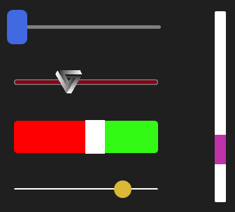
Change a value by moving a Slider’s handle in a specified range. Note: Once dragging any Vertex objects property onto a ControlViews Page, Vertex can automatically create a Slider with a reference (assigned Source Property) to this property. |
|
|
||
Value |
Value generated by the slider in a linear range in between the “Min” and “Max” value |
|
Orientation |
Select from dropdown menu: -Horizontal (left – right) -Vertical (down - up) |
|
Value Changed Script |
Script will get executed every time the value changes |
|
Value Changed WebScript |
Script will get executed every time the value changes in Web only |
|
Source Property |
Source Property. Assign any Vertex Objects property. This property will be the reference for the Sliders “Value” property |
|
Invert Property |
Source Property. Assign any Vertex Objects property. This property will be the reference for the Sliders “Value” property, but will receive an inverted Value |
|
Invert |
Invert the value |
|
Increment |
Increment that will be applied to the Value when clicking on the sliders track instead of dragging the handle |
|
Max |
Maximum Value of the slider |
|
Min |
Minimum Value of the slider |
|
Handle Size W |
Width of the handle |
|
Handle Size H |
Height of the handle |
|
Background Content |
Select or drag’drop any Content from the Vertex project to be displayed in the sliders background |
|
Handle Content |
Select or drag’drop any Content from the Vertex project to be displayed in the sliders handle |
|
Background Size Mode |
Size Mode of the Background Content Options: -None: Image Content will be displayed in the sliders background in native resolution. Positioned in center -Fill: Image Content will be stretched to fit the sliders background -Uniform: Image Content will be scaled proportionally to fit the sliders background -UniformToFill: Image Content will be scaled proportionally to fill the sliders background |
|
Handle Size Mode |
Size Mode of the Handle Content Options: -None: Image Content will be displayed in the sliders Handle in native resolution. Positioned in center -Fill: Image Content will be stretched to fit the sliders Handle -Uniform: Image Content will be scaled proportionally to fit the sliders Handle -UniformToFill: Image Content will be scaled proportionally to fill the sliders Handle |
|
Background Color |
Color property (controls background) |
|
Border Color |
Color property (controls border) |
|
Handle Border |
Color property (handle border background) |
|
Handle Color |
Color property (handle color border) |
|
Track Max Border |
Color property (color of track-border above handle) |
|
Track Max Color |
Color property (color of track above handle) |
|
Track Min Border |
Color property (color of track-border below handle) |
|
Track Min Color |
Color property (color of track below handle) |
|
Border Thickness |
Controls border thickness |
|
Corner Radius |
Controls corner radius |
|
Handle Border Size |
Border size of the sliders handle |
|
Handle Corner Radius |
Corner radius of the sliders handle |
|
Track Border Size |
Border size of the track |
|
Track Corner Radius |
Corner radius of the track |
|
Track Size |
Size of the track |
|
Slider2D |
||
|
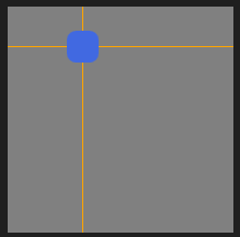
Change two values by moving a Slider’s handle in a specified range for both axis. The Slider2Ds property-set is pretty much comparable to the basic Sliders properties but offers additional properties to support a second axis. Use this Control to e.g. work with transform X/Y properties of Clips or with coordinates of Geometry Modifier FFD points for simple re-calibration.
|
|
Value X |
X- Value generated by the slider in a linear range in between the “Min X” and “Max X” value |
|
Value Y |
Y- Value generated by the slider in a linear range in between the “Min Y” and “Max Y” value |
|
Source X |
Source Property. Assign any Vertex Objects property. This property will be the reference for the Sliders “Value X” property |
|
Source X Invert |
Source Property. Assign any Vertex Objects property. This property will be the reference for the Sliders “Value X” property, but will receive an inverted Value |
|
Source Y |
Source Property. Assign any Vertex Objects property. This property will be the reference for the Sliders “Value Y” property |
|
Source Y Invert |
Source Property. Assign any Vertex Objects property. This property will be the reference for the Sliders “Value Y” property, but will receive an inverted Value |
|
Invert X |
Invert the Value X |
|
Invert Y |
Invert the Value Y |
|
Min X |
Minimum ValueX of the slider |
|
Max X |
Maximum ValueX of the slider |
|
Min Y |
Minimum ValueY of the slider |
|
Max Y |
Maximum ValueY of the slider |
|
Show Cross |
Deactive/ active the lines leading to the handle |
|
Cross Color |
Color property (cross) |
|
Swiper |
||
|
The Swiper generates relative Delta Values for two axis on pressing, holding and moving the mouse. Use this Control similar to a Slider2D, but without an absolute value range. |
|
Delta X |
X Delta value |
|
Delta Y |
Y Delta value |
|
Source X |
Source Property. Assign any Vertex Objects property. This property will be fed with the Swipers Delta X values |
|
Source Y |
Source Property. Assign any Vertex Objects property. This property will be fed with the Swipers Delta Y values |
|
Invert X |
Invert the Value X |
|
Invert Y |
Invert the Value Y |
|
Factor X |
Factor to be applied on Delta X value |
|
Factor Y |
Factor to be applied on Delta Y value |
|
Background Color |
Color property (controls background) |
|
Border Color |
Color property (controls border) |
|
Border Thickness |
Controls border thickness |
|
Corner Radius |
Controls corner radius |
|
Checkbox |
||
|
Select between two states: Checked and Unchecked. The event can trigger specific scripts or change a source properties value directly. |
|
|
||
Value |
Current value of the control |
|
Checked Script |
Script Code to be executed when the Checkbox gets checked |
|
Unchecked Script |
Script Code to be executed when the Checkbox gets unchecked |
|
Source |
Another Vertex Objects Property to link this Checkbox “Value” to. E.g. when connected with a Clips “Mute” property, the Checkbox will switch the Mute-Property from Unmuted to Muted when checking the Checkbox and vice versa. |
|
Check Box Background Color |
Color property (Background) |
|
Check Box Border Color |
Color property (Border) |
|
Check Marker Color |
Color property (Check Marker) |
|
Focus Color |
Color property (Focus) |
|
Mouse Down Color |
Color property (Mouse Down event) |
|
Mouse Over Color |
Color property (Mouse over event) |
|
Border Thickness |
Border thickness of the control |
|
Corner Radius |
Radius of the Control |
|
Dropdown |
||
|
Control with a dynamic quantity of selectable values. The Dropdown control provides both, the Value of the selected item and the Index of the selected item: ControlViewID.Controls.DropDownID.SelectedValue ControlViewID.Controls.DropDownID.SelectedIndex |
|
|
||
Selected Value |
Value of the selected Item |
|
Items |
List of items to be selectable |
|
On Change Script |
Script to be executed once the value has changed |
|
Index Offset |
Index Offset of the Items (e.g. when the first entry should have an Index of 0, set “Index Offset” to -1) |
|
Selected Index |
Index of the selected item |
|
Source |
Another Vertex Objects Property to link this Dropdowns “Selected Index” to. |
|
Font |
(parent property) |
|
Style |
Style of the font |
|
Weight |
Weight of the font |
|
Size |
Size of the font |
|
Font |
Font Type |
|
Background |
Color property (Background of static title) |
|
Border |
Color property (Border of static title) |
|
Glyph |
Color property (Glyph/ Arrow) |
|
List Background |
Color property (List Background) |
|
List Border |
Color property (List Border) |
|
List Highlight |
Color property (List Hightlight) |
|
List Text Color |
Color property (List Text) |
|
Text Color |
Color property (Static Title Text) |
|
Border Thickness |
Thickness of static title border |
|
Corner Radius |
Corner Radius of static title |
|
List Border Thickness |
Thickness of list border |
|
List Corner Radius |
Corner Radius of list |
|
List Highlight Corner Radius |
Corner Radius of highlighted list items |
|
Textbox |
||
|
Input Textbox for single- or multiline text. Text could get passed directly toother Vertex objects (e.g. Text-Content) by utilizing Source Properties without further scripting. |
|
|
||
Horizontal Alignment |
Alignment of text in the Textbox. Select from the Dropdown menu: -Left -Center -Right |
|
Text |
Text (Value of the Control) |
|
Source Property |
Another Vertex Objects Property to link this Textbox “Text” value to. (e.g. Text-Property of Text Content) |
|
Accepts Return |
If activated, pressing the keyboard return-key will be ignored when typing into the Textbox |
|
Show Vertical Scrollbar |
If activated, a vertical scrollbar will appear in the Textbox |
|
Font |
(parent property) |
|
Style |
Style of the font |
|
Weight |
Weight of the font |
|
Size |
Size of the font |
|
Font |
Font Type |
|
Caret Color |
Color property (Caret) |
|
Selected Text Color |
Color property (Selected Text) |
|
Text Color |
Color property (Text) |
|
Textbox Background Color |
Color property (Background) |
|
TextBox Border Color |
Color property (Border) |
|
Textbox Border Thickness |
Border Thickness of Textbox |
|
ColorPicker |
||
|
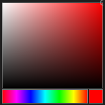
Intuitive Color selection. An additional slider for the Alpha channel could get activated as an option. |
|
Show Alpha Slider |
Slider for Alpha channel |
|
Color Changed |
Script to be executed on change of color |
|
Color |
Color property (selected color) |
|
Source Property |
Another Vertex Objects Property to link this ColorPickers “Color” value to. |
|
WebBrowser |
||
|
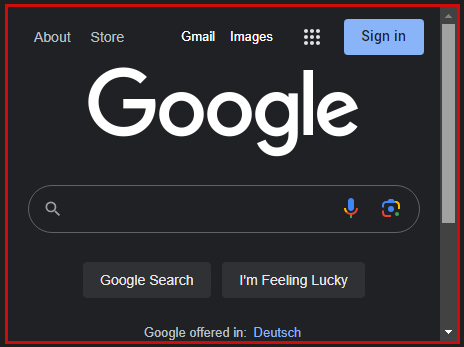
WebBrowser control to embed any HTML-Site into a ControlViews Page. Note: some websites suppress the feature to be embedded as an iframe on other pages. This will result in a blank page or an error message when using the ControlView in a Webbrowser (WebView). |
|
|
||
Url |
Adress of the page (LAN or web) |
|
Background Color |
Color property (Background) |
|
Border Color |
Color property (Border) |
|
Border Thickness |
Thickness of border |
|
Corner Radius |
Radius of Corners |
|
Whiteboard |
||
|
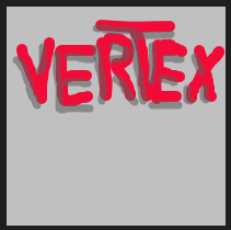
The Whiteboard is an interactive control to draw on a blank canvas. Every ControlViewer and every WebClient has it’s own blank Whiteboard and instances are not synchronized. Drawn results can be stored on hard drive and optionally get imported as Content into the Vertex project. |
|
|
||
Fit To Curve |
Curve optimization |
|
Highlighter |
Hightlight-Feature of the Pen |
|
Pen Color |
Color property (Pen) |
|
Pen Size |
Size of the Pens tip |
|
Snap Shot Path |
Path on local hard drive to store the images |
|
Web Snapshot Overwrite |
When set, alle web snapshots will use the same path and overwrite each other |
|
Show Web Clear Button |
Clear Button below Whiteboard (WebView only) |
|
Show Web Controls |
Controls below Whiteboard (WebView only) |
|
Show Web Save Button |
Save Buttun below Whiteboard (WebView only) |
|
Webview Save Add Content |
Add content to vertex project at Save (WebView only) |
|
Background Color |
Color property (Background) |
|
Border Color |
Color property (Border) |
|
Border Thickness |
Thickness of border |
|
Corner Radius |
Radius of Corners |
|
Password |
||
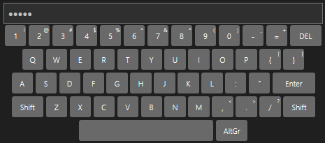
Keyboard Control to type in a password. If the password matches the “Password”-Value of the Control, the Script gets executed. |
||
|
||
Language |
Select a keyboard layout from the dropdown menu |
|
Script Code |
Script Code to be executed if the password is correct |
|
Password |
Password to be typed in |
|
Background Color |
Color property (Background) |
|
Border Color |
Color property (Border) |
|
Key Background Color |
Color property (Key Background) |
|
Border Thickness |
Thickness of Control Border |
|
Corner Radius |
Radius of Control Corners |
|
Key Corner Radius |
Radius of Key Corners |
|
PinCode |
||
|
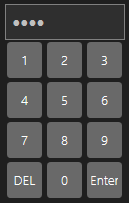
PinCode Control to type in a pin code. If the pin code matches the “Pin Code”-Value of the Control, the Script gets executed. |
|
Script Code |
Script Code to be executed if the pin code is correct |
|
Pin Code |
Pin Code to be typed in |
|
Background Color |
Color property (Background) |
|
Border Color |
Color property (Border) |
|
Key Background Color |
Color property (Key Background) |
|
Border Thickness |
Thickness of Control Border |
|
Corner Radius |
Radius of Control Corners |
|
Key Corner Radius |
Radius of Key Corners |
|
KeyPad |
||
|
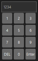
KeyPad Control to type in a numerical value. |
|
Script Code |
Script Code to be executed when pressing “Enter” in the control |
|
Current Value |
Code Value typed in |
|
Background Color |
Color property (Background) |
|
Border Color |
Color property (Border) |
|
Key Background Color |
Color property (Key Background) |
|
Border Thickness |
Thickness of Control Border |
|
Corner Radius |
Radius of Control Corners |
|
Key Corner Radius |
Radius of Key Corners |
|
Output |
||
|---|---|---|
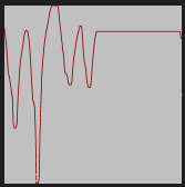
Line Graph |
||
|
Control to plot values on a time scale. |
|
Source Property |
Assign any Vertex objects property to this control to plot it’s value changes. |
|
Background Color |
Color property (Background) |
|
Border Color |
Color property (Border) |
|
Border Thickness |
Thickness of Control Border |
|
Corner Radius |
Radius of Control Corners |
|
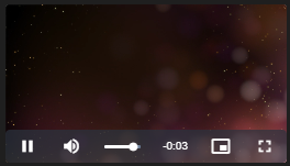
Video Player |
||
|
Embeds video content of a Vertex Project. |
|
Size Mode |
Size Mode of the content items Options: -None: Video Content will be displayed in native resolution. Positioned in center inside the controls boundaries -Fill: Video Content will be stretched to fit the controls size -Uniform: Video Content will be scaled proportionally to fit the controls size UniformToFill: Video Content will be scaled proportionally to fill the controls size |
|
Transport |
Select from the dropdown menu: -Stop -Play (and loop) -Pause |
|
Volume |
Volume of the VideoPlayer |
|
Video Content |
Content Property |
|
Show Playback Controls |
Activates/ deactivates the Playback Control Buttons (WebView only) |
|
Background Color |
Color property (Background) |
|
Border Thickness |
Thickness of Control Border |
|
Corner Radius |
Radius of Control Corners
|
|










 ON image

